DESIGN IDENTITY FOR ANTIPLAGIAT
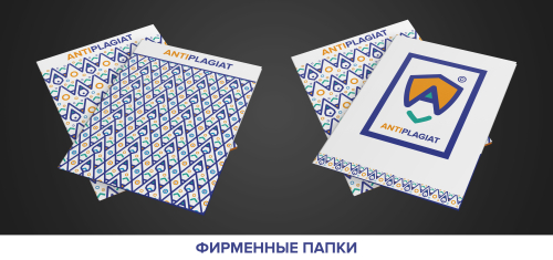
Friends always asks me, what I am doing at work/freelance. One of the work that I am engaged is the creating of design. Below I will show you my work to the contest of design Identity for "Antiplagiat. The task was to create a logo (which will reming in some things the previous logo) and to create some elements of design. The components of the corporate identity:
Copyright symbol - Copyright.
Shield - a symbol of protection of copyright.
LETTER «A». The first letter of the name of the Internet service in Latin script and Cyrillic.
Check mark - the sign to indicate agreement, correctness. It symbolizes the quality work online - service and a thorough check of the text. PENCIL. The image created by combining the letters "A" and a tick. It symbolizes the written text and its originality.
Element - the eye. The eye is a symbol of vigilance, omniscience, and it means that the Internet system - service "Anti-plagiarism" will always be able to find borrowing or copyright infringement.


